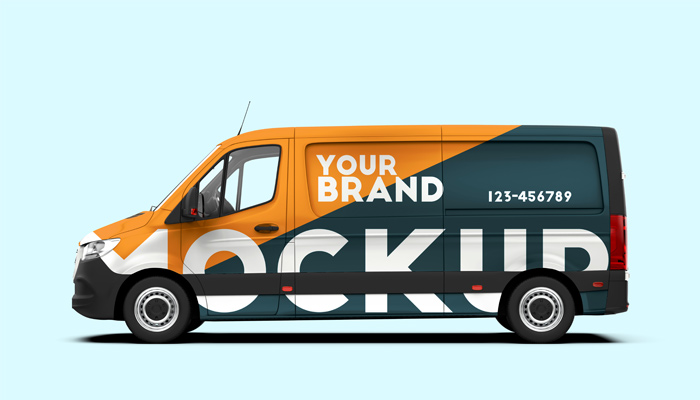
Businesses are often judged by their marketing and graphics strategies. Vehicle graphics is a marketing strategy that plays a huge role in business advertising. With millions of cars on the road, you have a ready audience. More than an attractive image on a truck or van, graphics on vehicles help businesses promote brand awareness. It is a very cost-effective form of advertising, and can help build business credibility. However, vehicle graphics should be done correctly to be useful and effective. Here are some common mistakes you need to avoid when designing vehicle graphics:
- Missing Vital Information: Make sure you deliver the critical information about your business on the graphics. When people pass your company vehicle on the road, they’ll see the side that faces them. So make sure that your brand and contact information can be viewed from every angle such as the hood and roof, the bodyside, and the rear of the vehicle.
- Adding Too Much Information: Make sure not to overcrowd your graphics with too much of information. People seeing your vehicle on the road or when it is parked can only process and retain a limited amount of information. So, limit the text you put in your design.
Before you start designing the wrap for your vehicle, determine what the most important information is, focus on who you are, what you do, how to contact you, and a call to action. Add only most critical details such as Company name and logo, Contact information, Website address, Call to Action, Something to indicate services and a Tag line or slogan if you have one.
- Vehicle Wrap and Design Doesn’t Fit the Vehicle: Ignoring a vehicle’s curves and details is a common mistake. While wrapping your vehicle, think about the curves, body lines, door handles, trim, and add-on equipment of the vehicle. The design should work with shape of the vehicle, not against it. For instance, the gas cap, the shark air vent or the minor gaps in your design where the doors are located need to be taken into consideration while wrapping your vehicle. Avoid cutting a logo or letter in half at a door joint. An experienced vehicle wrap service can guide you in positioning your vital information effectively.
- Designs with Complicated Fonts, Images And Fancy Effects: Choose a simple but attention grabbing design. Complicating your design with various fonts, images and special effects is not going to help you in advertising your brand as vehicle graphics only have just five seconds or less to capture consumers’ attention. Choose vibrant colors and bold graphics for your vehicle wrap to stand out in traffic, but avoid cluttered design. There is a delicate balance between attention-grabbing and clarity when it comes to a vehicle wrap.
- Too Small: Remember that bigger is better when designing your vehicle wrap. Balance the size of the text between readability and clean design. You should be able to capture viewers’ attention.
- Using Poor Material: Using wrong or poor material for vehicle wrapping is a big mistake as it will cost you more in the long run. Avoid trying to saving money on the material and use good quality material like vinyl.
Vehicle graphics and wraps are a big investment. So, take care to avoid these vehicle graphic design mistakes and design a wrap that fits the vehicle and showcases your brand effectively. Use legible typography, colors that fit your industry and brand, and a design that conveys the right message. A professional advertising agency that offers vehicle graphics can work with you to design the best solution for your needs.

